Advanced Search
Re-designing advanced search into an interactive and efficient process
ADVANCED SEARCH
Recreating Advanced Search Experience

BACKGROUND
At Oak Ridge National Laboratory (ORNL), researchers draft, review, publish, and store all their papers through an internal application PUBLICATION. The whole application has been under re-designing since 2016.
Searching papers is a high-volume activity at the lab. We’ve built the new Quick search with one search input field, which lets people to get results just by entering keywords. Next we were going to design the advanced search which enables people to search from every possible piece of metadata from a publication.
The old advanced search is cumbersome to use due to the way the search criteria are presented. Think about a scenario when you are a researcher searching for journals published after 1985, from a given organization, possibly written by anyone in your group, and with a specific sponsor. You seek very hard for those fields crammed closely on a two-foot long page. While results can’t be saved, the next time you have to go through the same process again. How frustrating is that!
GOAL
Most of our users were using a 13-inch laptops. Dealing with overloaded information on small screens was our No.1 concern in terms of usability. Our design challenge was:
- Make it as easy as possible for users to locate the criteria they are looking for
- Enable users to efficiently complete advanced search without being overwhelmed
- Include saved search to speed up the process
There were a lot more to this project, but I am only using this as an example of my design thinking process.
SOLUTIONS
How do we switch between advanced and quick search?
I looked into a bunch of advanced search examples for online libraries to see how they connected the two searches. In our case, the number of search fields we offer was much heavier. Basically all the metadata relate to a publication were searchable. In total there were 18 categories of searchable fields, and each contained sub categories. Considering the information load, I thought it was necessary to make advanced search a separate screen instead of an extension of quick search sharing the same screen.

Transition between Quick and Advanced search
Explorations
How much information can we put in a small laptop screen? What is the right amount of information that won’t overload the user cognitively? The answers would depend on the design itself. I was trying to fit the searchable criteria, a summary of selected criteria and saved search on one screen. I played with different options with a few examples here:
Prioritize Information
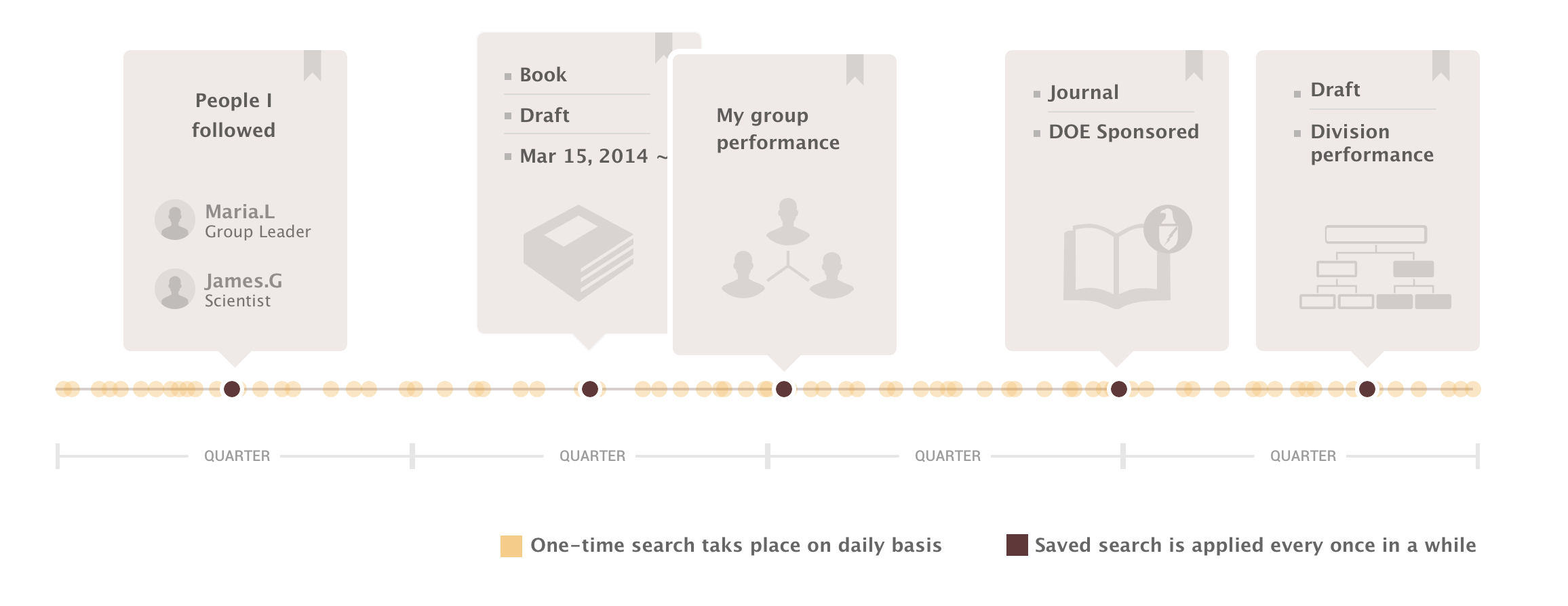
During our research, we dug extremely hard in finding out the real user behavior. Our user interviews told us that: individual researchers would start a fresh search more than saved search. They were mostly searching for a specific paper or a person’s paper. Saved search would be more useful for managers/ group leaders to review quarter/yearly performance. Once saved search was set up, they would come every a few months to run the results.

I decided to hide all the saved search which can be triggered through a drop list. So Saved search option_2 was picked.
Further pushing the design
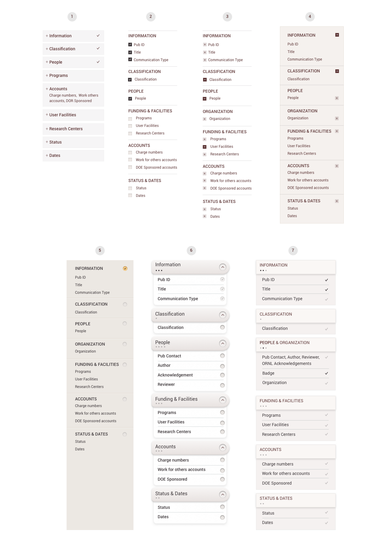
Among the solutions for adding search criteria, Search Criteria option_4 stood out because:
It let people build up the page, so the page would only get longer when there is more criteria.
On left column, the grouped categories worked as an outline to remind users the possible search fields.
While we seemed to have a solution, I always want to streamline the information load as much as possible while keeping all the features for enterprise applications. I noticed that I’ve kept the Search input fields and the Selected fields side by side. I challenged myself by asking: Do people need to see the summary simultaneously when they are picking search fields? Is this an assumption I make?
What if…they can be combined?

It worked! When one group expanded, it showed all the search criteria within the group. When it collapsed, it showed the selected criteria in the header. In this way we could clean up the page with only 2-column layout. The screen was successfully simplified.
Always checking the problem statement
Now it was a good time to revisit some of the initial goals I set before I started designing:
✔ Make it easy to pick search criteria
✔ Avoid unnecessary scrolling on small screen
✔ Enabled saved search
IT’S ALL ABOUT CRAFT
To further polish the design, I played with different option to visualize the column for search categories.

With several rounds of iterations I chose option 5 because it’s simple, straight forward and visually fit into the page. Do you like it?
PUTTING TOGETHER THE FLOW
Here is how the advanced search in production with all the design pieces assembled together.
DESIGN GALLERY
TEAM: Tony Smith, Robin Auerbach
MY ROLE: Interaction design, UI design, Prototyping
TIMELINE: 09/2017 - 10/2017


