
Project & Portfolio Management Tool
A tool to set up projects that researchers can track their projects in terms of milestones, cost, timelines and project status.
PROJECT & PORTFOLIO MANAGEMENT TOOL
A tool to set up projects that researchers can track their projects in terms of milestones, cost, timelines and project status.

Introduction
RESolution is a centralized researcher support system developed by Oak Ridge National Laboratory to help researchers manage their day to day task efficiently.
Project and Portfolio Management Tool is one of the modules in RESolution. It aims to help users track their project deliverables and milestones, identify who is charging against their projects and how they are performing against the plan. This tool also enables researchers to monitor and manage a group of projects at the same time inside a portfolio.
Started in 2015, our design goal was to let our users:
Start a project
Edit an existing project
Track milestones, cost and performance again plan over time
Create a portfolio and check the project health within the portfolio
Designing Project Management
At the fuzzy beginning, we had no idea how this application would look like. We started by writing out the core components of a project on the white board like labor, milestones, and risk etc. We were trying to map out our understanding of those components and how they could roughly look like as interface.

From Information Structure to Prototype
After we got a rough understanding of this project, it was time to connect the dots. Our goal was to design a workflow guiding users through the project setup and providing validation logic to the main two states of the project: Draft and Live (in progress).
We sketched a flow about what a user would do to start a project, from filling in the project basic information, publishing the project, to generating a dashboard for project status.

I made a few prototypes to demonstrate how I imagined this app can look like. The idea was that the “create a project“ button would generate a project card. In the Draft phase clicking the card led to project set up. After the project was Live, clicking the project card led to the dashboard. The set up would always be editable.
The clickthrough helped us to get a feeling about the scale of our design, and it was much easier to start a discussion within the team.
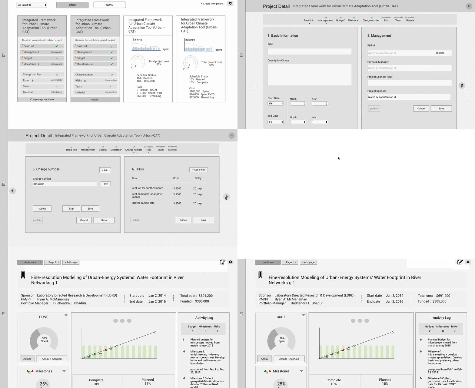
Option 1
To edit an existing project, go to a different screen which takes the full screen to change the set up.
Question: Would users easily understand that the project is transiting from a draft to live state?
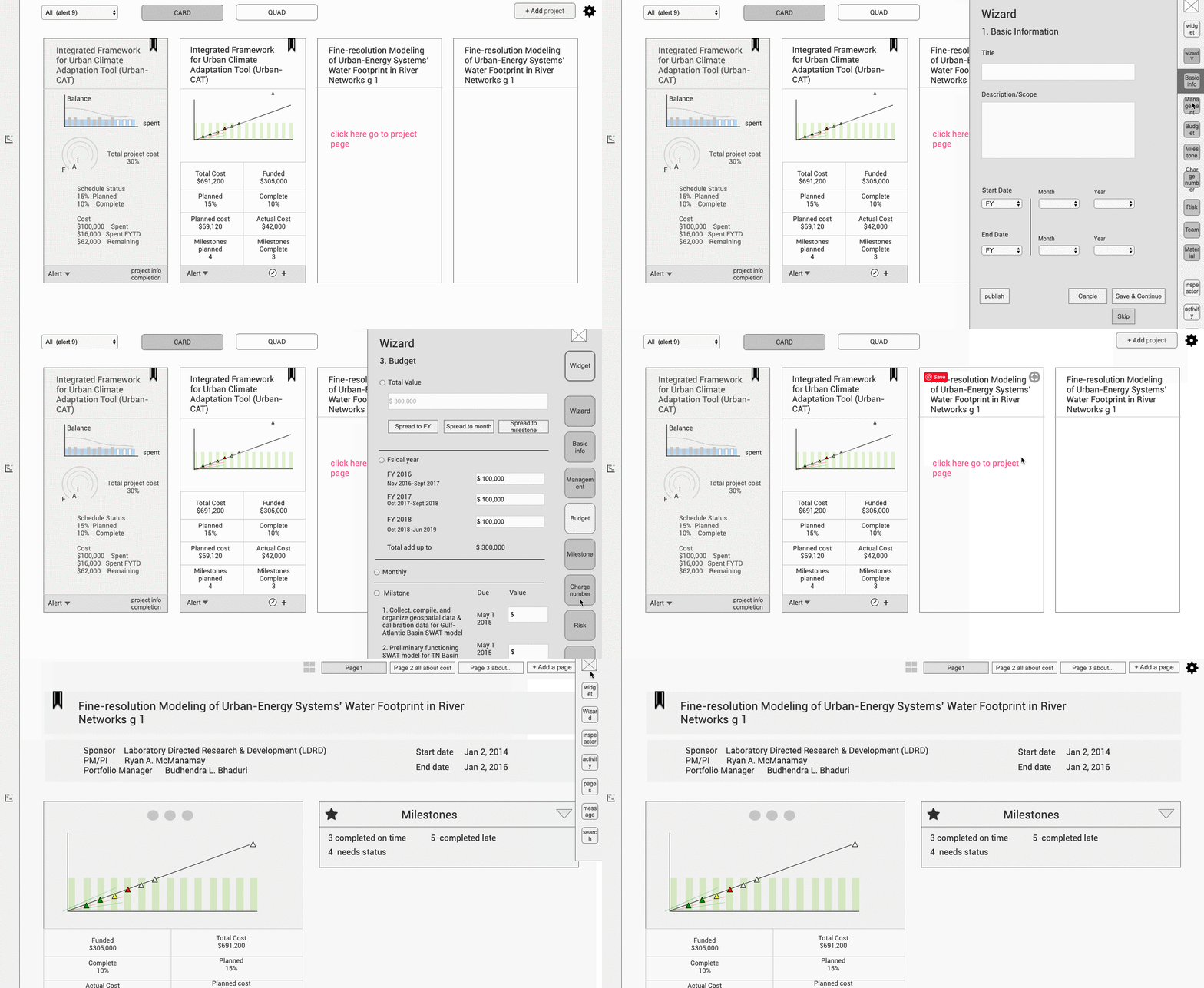
Option 2
When adding a project, use a wizard as a fly out to fill in set up.
Question: If dashboard is always the first thing to show when clicking on a project, do we show an empty one when the project is still in draft?
Decisions to Make
With the questions in mind, we put more thought on to how a project cycle worked and made two decisions:
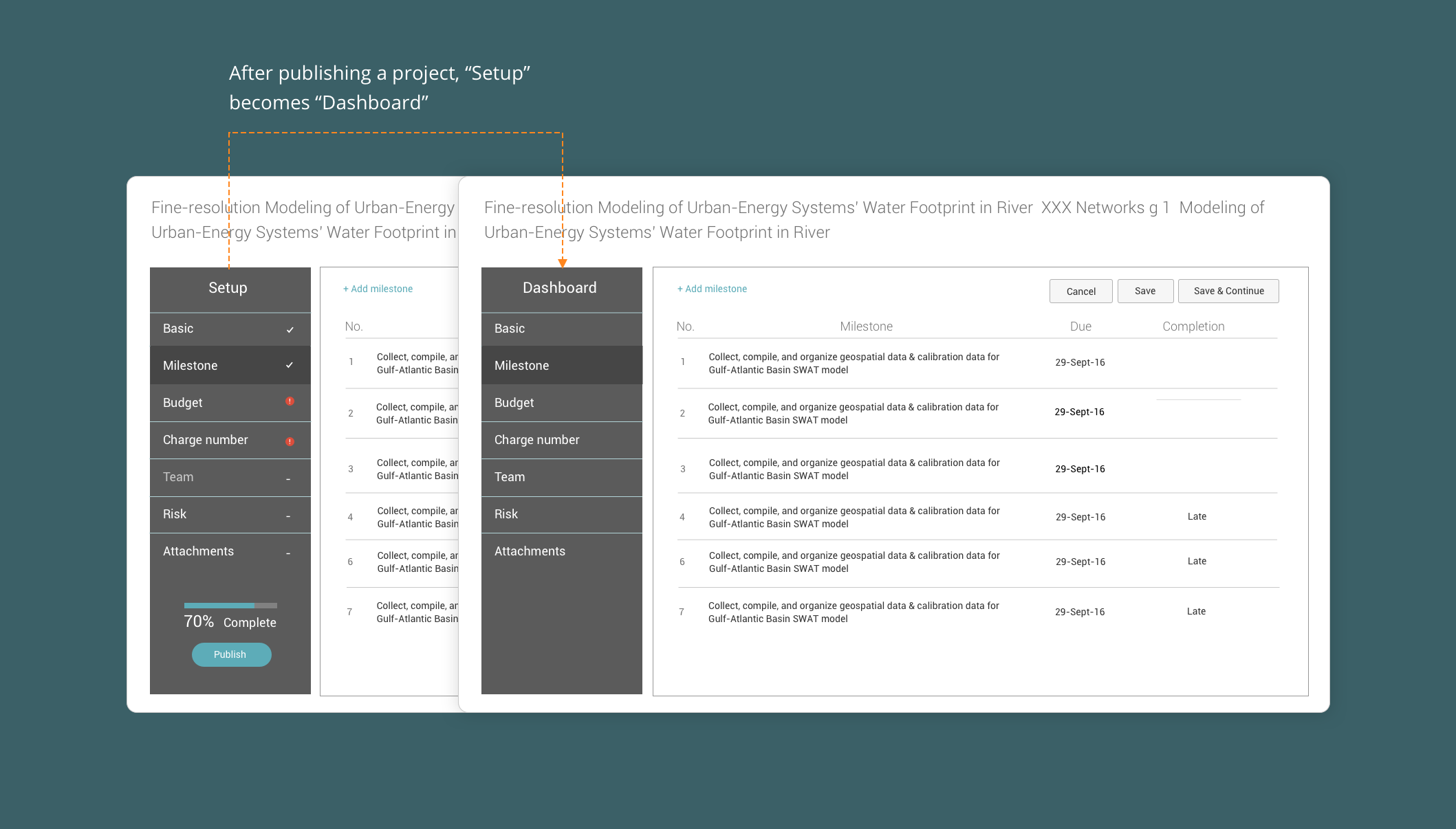
Indicate project stage transition explicitly using the tab area. In the prototypes the transition from Draft to Live project was not very clear. I came up with the idea to make the dashboard as a tab and bring it to the same screen with setup tabs. When it was “Setup“, users could fill in the form fields. After the project went live, I replaced “Setup“ with “Dashboard”.
Use full screen to show content of each tab. We discussed with clients about the amount of form fields in project set up. It would be more flexible to use a full screen instead of a fly out in context.
In this solution users would always land on a familiar screen but still aware of the project state. I designed vertical over horizontal tab area to save space for content on the screen.
Knocking Out the Exact Form fields
While we had designed the wireframe, we needed to settle down the specific content of the project set up. We had rounds of meetings with our clients to clarify the details of each setup screen such as:
What are the required and optional fields ?
What fields can’t be changed after project is live?
What are the form validation rules ? e.g. Can a project start in the past?
How to spread budget? Can we enter dates to spread across month?
We had a gradual learning process of design requirements, based on which we made hypothesis of user needs, sketched design, showed concepts to clients, and sometimes designed together to reach an optimal solution. I worked out all the form editing scenarios, including empty states, editing, after edit, removed fields etc.

Project Setup form fields design
Project Dashboard
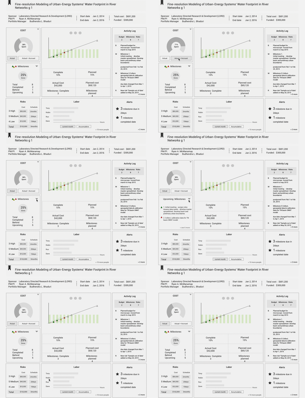
When a project is live, it starts to have progress, milestone updates, cost changes and alerts which can be summarized on project dashboard. At the early sketches we had two directions of dashboard design.
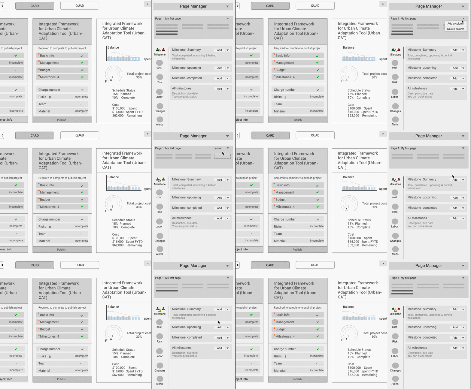
Option 1 - Flexible dashboard
Users can customize the layout (e.g the number of columns) and select widget to show on dashboard
Option 2 - Static dashboard
The dashboard shows the same types of widgets. There can be different views per widget.
Initially we liked option a because it felt flexible to let users customize the way they want per project. However, the downside was that users may miss adding widgets with important information like alerts. Besides, the widgets in varied sizes wouldn’t fit nicely on dashboard. Thus we went for option 2 with a standard dashboard, which was easier for users compare projects as well.
Further Pushing the Widgets
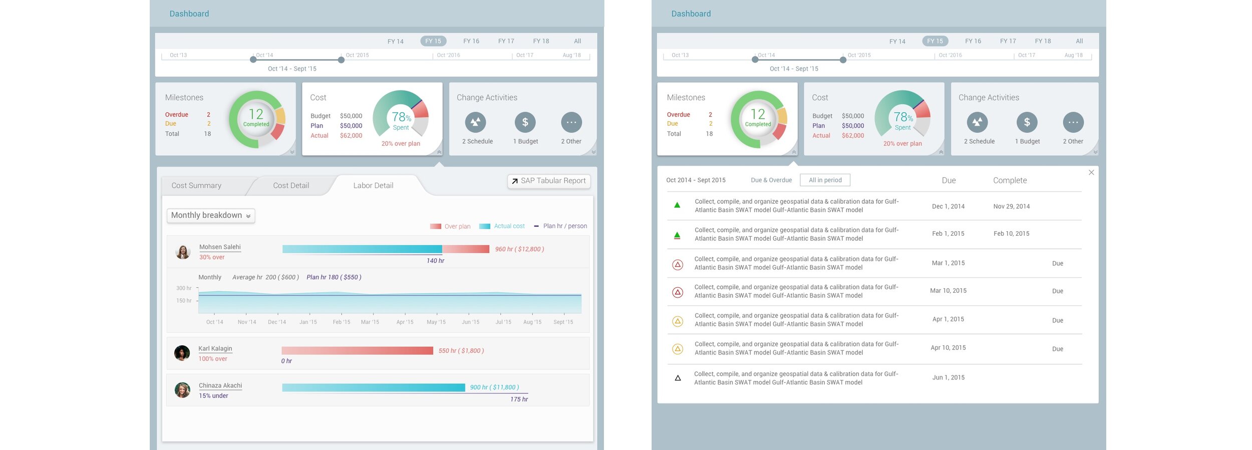
After we had laid out the dashboard widgets, we evaluated if they were able to hold enough information and be scalable. For example, one milestone description could be long and take the space of the whole milestone widget.
The solution I came up with was to reveal the information into 2 steps. The first view was summarized milestone counts, clicking it would show an expanded view with detailed milestone description.

We’ve further simplified the dashboard by:
Combining repetitive widgets cost and labor
Removing alerts widget as in RESolution it was a pattern to show alerts under the header
Removing risk widget as it was not as signifiant as other content
Cost Chart
The core feature of the dashboard was the cost chart for tracking project spending. We were aiming to create a visual presentation for users to get a quick idea of the project progress, issues and next steps.
It was quite a challenge to integrate time, milestones, cost and people into one view. Heavily inspired by the online stock charts, I’ve been exploring this piece since the very beginning of this project, which has given me plenty of time to look for the suitable format. Some of my explorations:

It seemed to be hard to compare the values when they were listed row by row. So I created more options to better highlight the comparison. I showed my design to the team and we liked the all-in-one idea because it showed the values intuitively by connecting all the values together.

One problem with the all in one chart, when users move their mouse along the timeline, the popping up values on the graph looked crowded and obstruct readability of the chart. The alternative I came up with was to: 1. indicate the meaning of values on a legend; 2. show the value numbers apart from the chart:

I enjoyed the challenge of visualizing information to present data efficiently. One task here was to use colors to differentiate components but not making it too colorful. I was very careful when choosing the colors. For example, I tried not use orange and red too much as they were normally used for alerts in RESolution. The repetition of colors couldn’t be avoided, but I’ve managed to keep enough difference within the same context.
Designing Portfolio
Users could group multiple projects into a portfolio and have multiple portfolios. The purpose of this section was to let users:
Track and monitor their projects
Indicate project health in terms of schedule and cost
Compare data across projects
At the very beginning we had the idea of using a four-quadrant graph to indicate the project health - ahead/behind schedule and above/below cost.

I followed up with this idea and further developed it into a polished design. I was heavily inspired by real estate searching websites. In my design, all the projects were located on the quadrant on the left of the screen, clicking one would reveal the project detail on the right. I created a two-way interaction between the quadrant and the list for the maximum flexibility for users to browse their projects.
Each dot is a project, the color of the dot indicates if the project has milestone that is overdue (red dot), due (yellow dot) and green (completed on time). From the graph, clicking a dot would filter the list on the right and show the project detail. From the list, users can select one project or a group of projects sharing the same status which will be shown on the graph.
Inconsistency in design
On the portfolio screen, one thing I designed on the spot was the renaming of a portfolio. In the Project section, there is a project information tab which includes title, description, sponsor etc. We could rename the project by editing one of the form fields. In Portfolio, there was no information tab because the title was the only metadata of a portfolio, therefore we didn’t think it was necessary to create a tab for it. At the moment I used a drop menu beside the title to include the rename option.

The way renaming works in Project and Portfolio is different.
After the Project and Portfolio Management module was complete, we designed more modules for RESolution. Like the Project section, each module contains a number of tabs, under which users can edit the module title as one of the form fields. The way portfolio title renaming worked became unique in RESolution. Users might find this feature inconsistent with other part of the app.
Other highlights
Outside what I’ve described above, I have also worked on other things of this project.
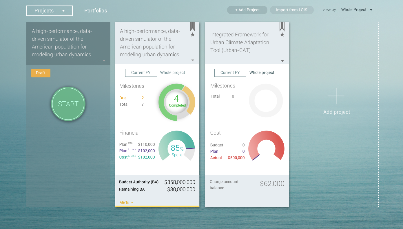
The list of project cards. A draft card shows whether it’s ready to make a project live. A live card indicates project status and alerts.
I listed out all the states for form editing when handling over the design to developers.

I designed the portfolio dashboard which summarized all the project status and compared across projects.

I created mobile solutions for different devices.

TEAM: Ken Lowery, Priyanka Sarawgi
MY ROLE: Interaction design, UI design, Prototyping
TIMELINE: 05/2015 - 10/2016