Publication
Design a system for researchers to manage their internal review and release publication process
PUBLICATION
Re-design a system for researchers to manage their publications

Why Use Publication?
At Oak Ridge National Laboratory (ORNL), all the publications are required to go through the internal review workflow before being sent to publishers. The system lets researchers fill in relevant information, upload a document, and go through a review flow. Once one reviewer completes, the system alerts the next reviewer in the workflow. This process is complete after all the reviewers have approved.
Many researchers were not willing to follow this protocol because the whole process was time consuming. For example, the timeline for a document to be approved was unclear and communicating with reviewers was not convenient. It also required a lot of effort to fill in the metadata because the system interface was quite confusing.
Redesign the System
In 2016 we kick started re-design of the entire system aiming to:
Simplify the researcher workflow (submission, review, and release process) and provide easy access to information
Notify users the progress of their publications in review
Provide help for users to go through the process with less difficulty to increase the compliance to usage
Create a user-friendly interface
Provide publication metrics to make the system more valuable
Workflow Navigation Design
A new workflow to orient and guide user through the review process
Here is a screen shot of the Approval process in the old system. Both researchers and reviewers had access to the publication. For researchers, the Approval part was especially difficult to use as they couldn’t easily locate themselves in the process and take actions:

We aimed to redesign the whole experience by visualizing the workflow, allowing researchers to access all the review process and communicate conveniently with reviewers. We proposed a new navigation design allowing users to travel through each approval step. The navigate also integrated the whole publication cycle including 3 stages:

Our design goal for the new navigation was to:
Make it clear for users to orient and navigate through the system
Indicate if actions were required
Create progress indicator to help users to locate themselves in the flow and create a sense of accomplishments.
The new navigation would require a lot of effort from our developer’s team and its workload had to be planned ahead. Therefore it was the first design I tackled in this project. I proposed three directions of where the navigation could be on the Approval screen and evaluated within our team:

It was not a quick choice. I showed our team several sketches around each direction. We discussed the ability to fit the main user screen size, the efficiency to show sufficient information, and the potential to apply the design to all the 3 stages of the publication cycle. Eventually we went for the 3rd direction.
I started to brainstorm design variations for the 1-layer navigation. During this process I usually came up with multiple options. Afterwards I shared with my team for feedback, analyze the pros and cons. In the design I integrated information including each approval step, reviewer and review results:

At this moment the navigation was taking shape. I asked myself the following questions to test if our design goals were met:
Do users know where they are in the workflow? Are users aware of the upcoming steps?
Is it clear which elements are clickable?
Can they tell if there is an alert and act on it?
There were strengths from each of the iterations we had. From there I integrated the good elements into an optimal solution which had clean visuals and sufficient information clarity. While having the concern of it taking too much space on the standard laptop screen size of users, I’ve also created a collapsed view when users scrolling down the page.

Final design for the approval screen:

Publication Dashboard
Providing publication metrics for organization
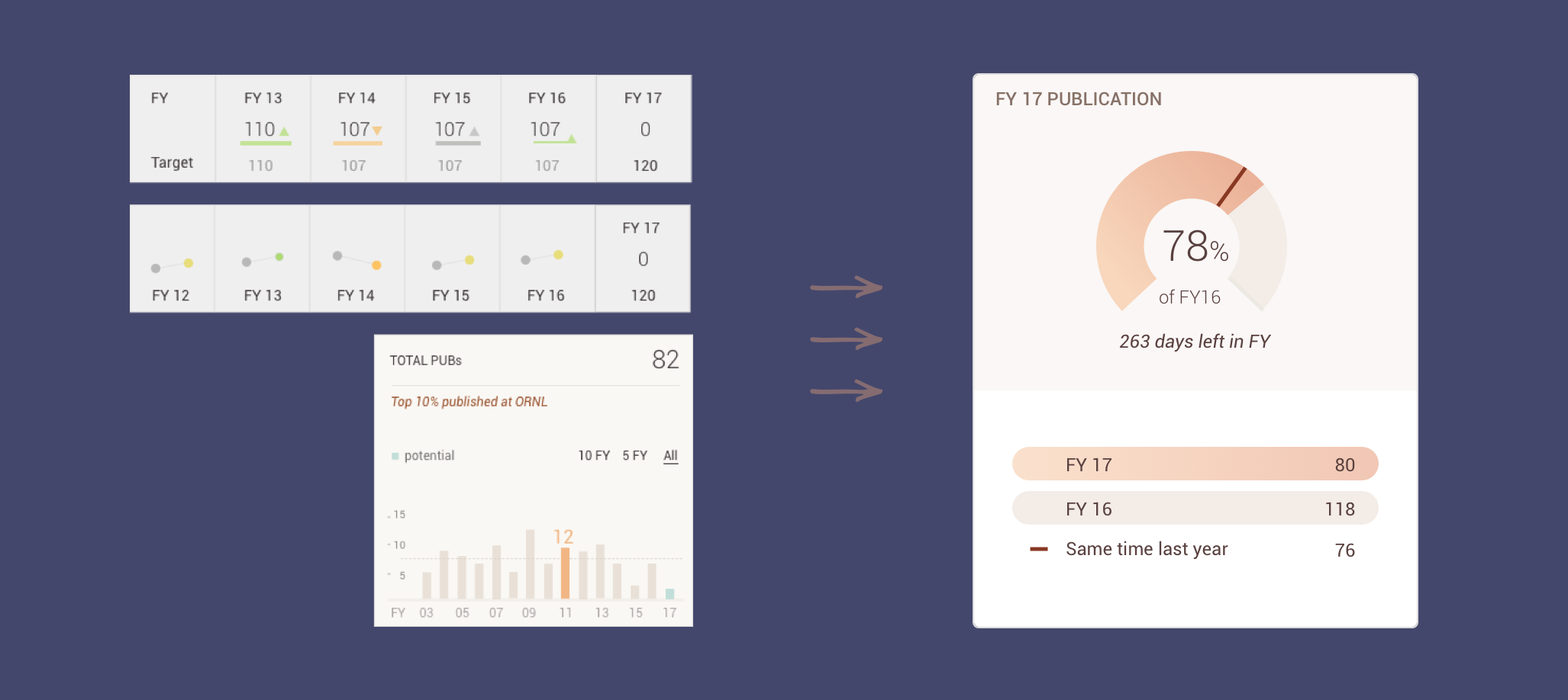
Not only visualizing the workflow, we also wanted to add extra value to the system to motivate users to use it. Having publication database at the lab, showing a quantitative report for the publication output on organization would be very interesting. We brainstormed as a team for what we could generate with the data:
Compare publications across year
Compare different types of publications
Compare the status of publications: draft, in progress, awaiting publications etc.
List of Recently published papers, programs, sponsors
…
I was trying to reveal the information density as much as possible in each widget. I sketched different representatives of data and showed to our users.

One thing we found was that they wanted to see the growing or declining trends of publications across years, but mostly between last and the current year.Thus we focused on comparing the number of publications at the same time of the two years.

I’ve also taken into consideration of how publication data would look like in edge case. For example, it would always look empty at the beginning of a year. If the organization has zero publication, would it still look nice and encouraging on dashboard? So I created design for different scenarios:

Due to the heavy information load we wanted to show, clicking on the numbers on the widget could link to more detailed information in a new screen. In the design I added a background color to the clickable numbers.

In the end I experimented with colors to fit our warm yellow background.

Show A Publication Status
Creating visual hierarchy to enhance readability and direct users to take actions
One researcher could have zero to multiple ongoing publications at the same time. We were aiming to provide them a view of those publication to let them:
Have a quick glance of what their publications were by showing basic information like title, types, dates
Immediately understand if action was needed. We could show the publication status like its stage in the workflow, new comments, alerts etc.
I sketched ideas to integrate the above information in card formats. I started from different formats of long cards, and developed into tall cards because they were more flexible for multi-reviewer and more mobile friendly.

One issue of this design was that in the multi-reviewer case, some required actions could be off the card, users would need to scroll to see them. Apart from that, although I had laid out all the information on the card, it looked a bit wordy.
Further Pushing the Design
When I think about a publication, what jumps into my mind is lots of text on paper. However, when designing an identity for a publication, I’d like to make it a bit more graphical. I came up with with the following horse-shoe graph to better indicate the approval flow. I used a list of icons to indicate the feedback from each reviewer.

I created donut chart for different publication status:

Users rely on the information hierarchy to read and act. I’ve further pushed the visual design to give use cue to users what they were expected to do.
I doubted if it could be too colorful especially when looking at the five cards in a row. However in the real scenario, a researcher was unlikely to have so many publications in progress at the same time. Having strong color distinction could help users to be aware of their publication status just by scanning:

User Testing
Learn from users & Keep improving
When our developers have implemented the entire flow we ran user testing to refine the user experience and clear bugs. We invited researchers to a testing session, gave them tasks in going through the major flows and interviewed them afterwards. The tasks addressed the key functions, debatable design decisions and the value of Publications.
One issue we found was that some novice users weren’t quite sure about the meaning of certain functions. Sometimes explanation was needed by the facilitator. Thus we integrated user guide in context to help users have a smooth learning experience.


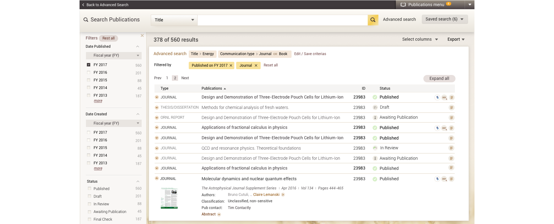
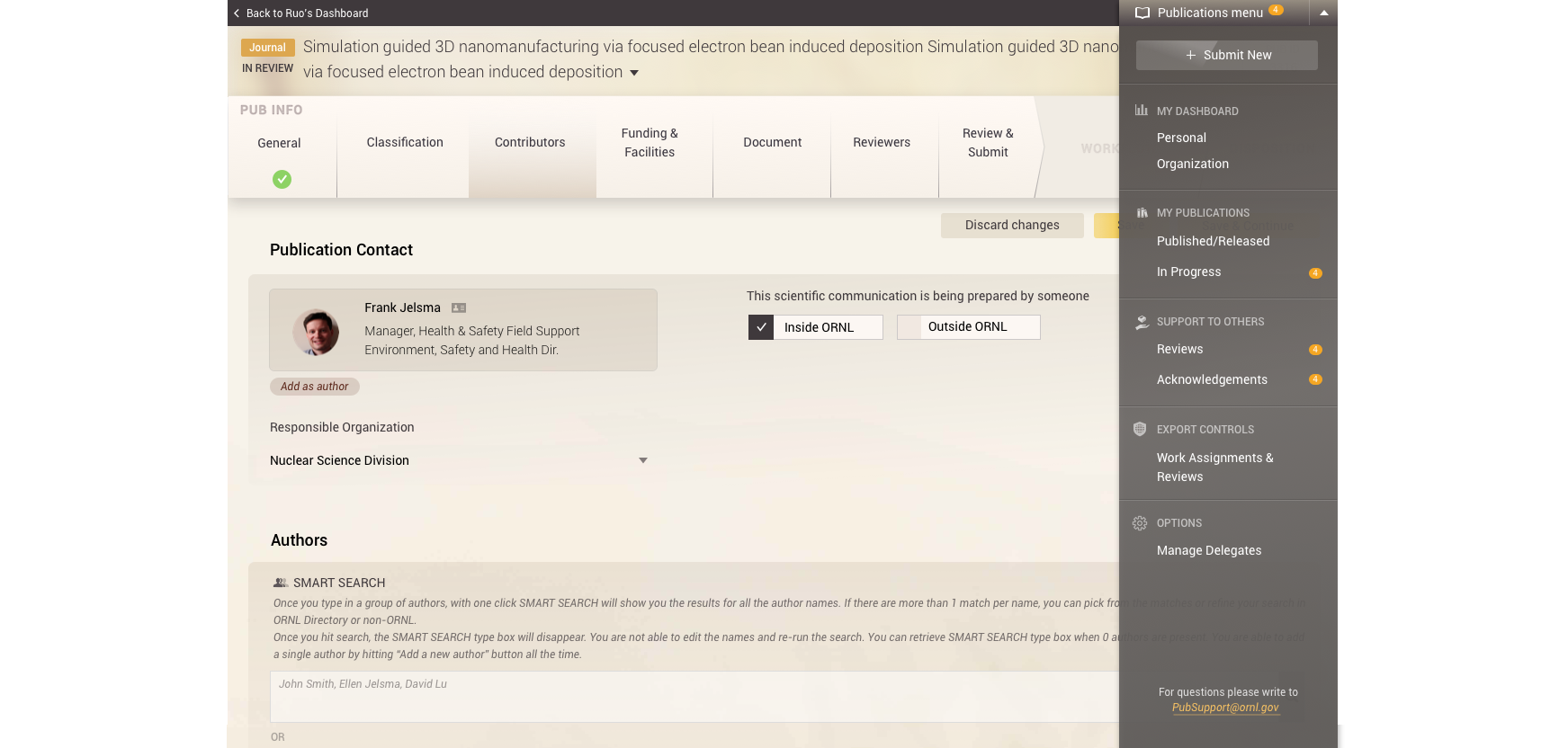
Data entry page and navigation menu.

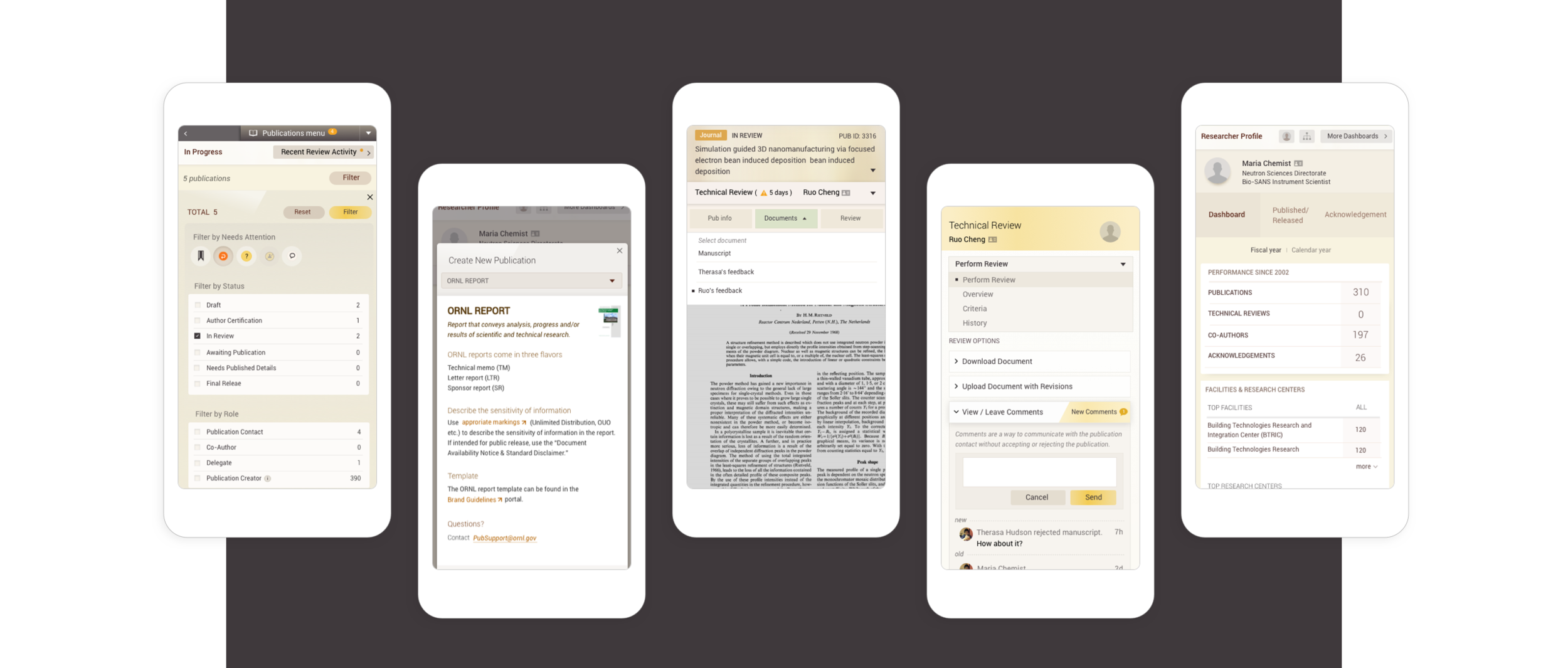
Our design has been optimized for mobile too.

Apart from the polished interfaces, I’ve also created transition effects with mainly Hype and Principle. It helped developers to see the whole flow of user interaction.
Learning
One of my learnings was to think about design elements as fluid and create rules for their changing states. I started to think about how would the elements built in code and provided the development team with spec markings in different scenarios. I appreciate our developers for their valuable input on how I could deliver design more seamlessly.

Continuing Effort
After design was in production, I conducted design reviews with our developers to check the visual differences. Some were easy to fix, some required a lot of work, so we designed together for a compromising solution. I’ve also been getting requests to provide irregular shapes, icons and design alternatives. Reaching out developers actively has helped me a lot in finding a solution for both design and development in limited time and budget. Our first release was on July, 2017.
We are constantly listening to our users’ feedback and receiving feature requests from our users and clients. I’ve been working with our team to add additional features and improve. For example, we’ve designed the administration page after our first release.
TEAM: Tony Smith, Robin Auerbach
MY ROLE: Interaction design, UI design, Prototyping
TIMELINE: 05/2016 - 01/2019