Design System for RESolution
Building a component library to manage design at scale
DESIGN SYSTEM
The development of a design system for Cadre5

Excessive patterns in Design
I have been working for Cadre5 designing digital applications which are complex in data, functions and processes.

The applications are developed on one platform. Belong to the same system but serving different functions, these Apps are highly distinguished from each other but also look consistent across the family. However during the design process, inconsistency happened.
For example, several similar colors were created with minor differences. Afterwards it was not clear which one was the primary color, which made it harder to manage color palette and caused extra work for the development team.

Many similar colors exists in designs. It’s only a small part of the color palette.
Initiating a Design Library
While our design team was expanding, a design system was needed to make reusable component which can save time for both the design and development side. it would be helpful to have a shared library for consistent design in the future. I was greatly inspired by Atomic Design.
Challenge
There has been a big variety of patterns built across different applications, each worked well in its own context. It was critical to make a selection of components that had been widely applicable in these apps and be universal for future designs.
Messy Start: Collecting Existing Components
I started by collecting all the repeatedly used components that come into my mind onto the sketch artboard and categorized them.

Collecting all the elements in the system together
Merging Similar Components
I listed all the variations that serves the same function, then sit with our team to discuss which ones to be kept, merged and on hold. In tab designs, I was surprised that there were more than twenty different patterns which could be grouped into five categories. We looked one by one and carefully made our decision after discussion:
Make tabs having the same structure but with different font sizes into one size;
If there is more than one designs for the same feature, pick one;
Unify similar designs into one stand design: color, spacing, size;
Leave the designs for a unique context for now as we don’t know if it will remain customized or be used again in future designs.

Categorizing all the tab designs and creating standard designs for future usage
Testing Out While Creating
It was common that the components were nested. I brought them into practices to verify if they fit different design context. Round trips were made constantly to refine the components. One thing I paid attention was that variations should be able to be anticipated to create new ones from a base component.

A base component can be transformed into different variations.
I was also checking if one component could make the design process more efficient. For example, when I started creating a button, I brought all the variations into one component, including button with text only / icon only / text with icon on left / text with icon on right. It was a powerful button, but when I used it, it was not that convenient to quickly configure the sketch overrides to get the button style I wanted. So later we divided the buttons into several categories and it has greatly speed up the crafting process.

Bridging the Gap In Design Handoff
I discussed with our developers about their requirements in design handoff, such as having identified spacing, and providing a solid color on borders rather than an opacity. They’ve also reviewed the design components. That has greatly helped us in making a design system that fit both of our process. Our developers were later working on creating a pattern library matching the component styles in design library.
Sharing the Design Library
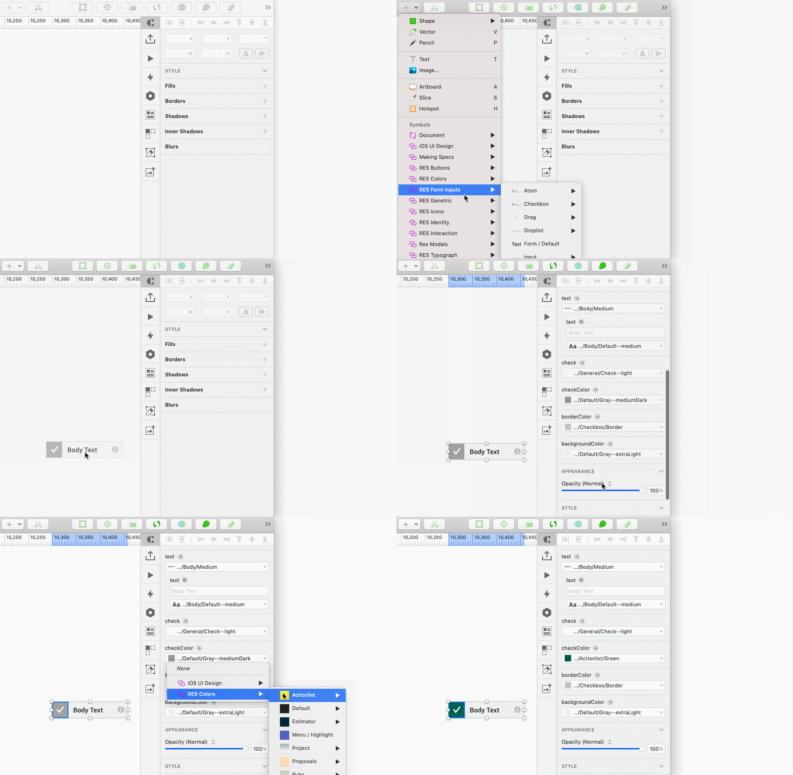
After the design system was built, we started to use shared libraries in sketch. It helped us keep consistency not only in one project but also across different projects in RESolution.

One of our checkbox component
Our Design System Now
Our design system contains most frequently used components from colors, buttons to page sections with documentation.
We are gradually adding new component (from new projects ) if they are potentially universal
The design library is currently richer than the dev library. It’s because sometimes we create temporary components to test them out before making it a final design & making it officially a new member of the library.
We keep expanding and maintaining our design system with updated components
TEAM: Mike Ellis
MY ROLE: Organizing existing design elements, Creating components
TIMELINE: 08/2018 - 06/2019

